Showing posts with label Branding. Show all posts
Showing posts with label Branding. Show all posts
Wednesday, November 7, 2012
Monday, May 28, 2012
Remembrance of things of the past - Materialism in a time of high tariff barriers
By Mukul Kesavan | http://www.telegraphindia.com/1120506/jsp/opinion/story_15457508.jsp
---


---
When I think of my childhood in late
middle age, I remember people less vividly than I remember things. I
remember scented erasers made of opaque rubber topped with a strip of
translucent green. Also a cheaper eraser enigmatically called Sandow.
And soap. The history of middle-class India in the 1960s and 1970s can
be written in soap and detergent.

Red Lifebuoy
was the soap you washed your hands with afterwards. Cinthol (green) was
the bar to bathe with except for people with aspirations who bought
Moti, a fat round of soap too large for small hands, or Pears. But Pears
was posh; any household that routinely used Pears wasn’t middle class;
it was the sort of place that bought crates of Coca Cola instead of
bottles of Kissan orange squash, where the children went to boarding
school and owned complete sets of Tintin.

The only detergent that seems to have survived as a brand is Surf. Not that anyone used the word ‘detergent’ in the 1960s. Surf was
detergent: it was the generic word for any powdered soap that came in a
box and was used to wash clothes. Nobody had heard of Rin or Nirma; a
cheap yellow cake of washing soap called Sunlight was widely used, but
it was an inferior thing, used offstage by the hired help, not the
housewife.
There was a
soap to wash woollens with called Lux Flakes, which smelt nice but
disappeared from the market early on. I think our parents liked the
thought of collecting petrol-perfumed woollens in giant brown paper bags
so much that they were willing to pay Novex and Snowhite a bit extra
for that privilege. Dry-cleaning was a way of being modern, smart and
confidently middle class.


Apart from
soap, childhood was defined by toothpaste. Nearly everybody used Colgate
and that hasn’t changed, but for a while Binaca Green was a real
contender. My earliest experience of difference was realizing that mine
was the only family amongst the people we knew which read The Statesman and brushed its teeth with a green toothpaste. Everyone else took the Times of India
and gloried in the peppermint joy of Colgate. We were pioneering
ecological puritans: we brushed our teeth with a horrible non-foaming
toothpaste that left us with a bad taste in the mouth entirely because
it claimed to be made up of chlorophyll. The only good thing to be said
for Binaca Green was that it sponsored a Radio Ceylon programme of filmi songs called Binaca Geet Mala.
There was a
short-lived star in the toothpaste stakes, though, called Signal, which
came in white and red stripes. Even a child my age who could barely
recognize a polysyllabic word knew that the red stripes were made of a
magical substance called hexachlorophene. Not that we cared: our
interest was limited to our scientific curiosity about how the
toothpaste worm came out continuously striped. It was later that I
learnt that hexachlorophene caused fits and paralysis and was especially
bad for children.
My
grandmother claimed that this bore out everything she had always
suspected about toothpaste; her solution was to make us scrub our teeth
with index fingers smeared with powdered coal. She called it ‘kala manjan’,
literally black tooth powder, and it came in small bottles with crude
red labels. It left you feeling gritty in the mouth for hours afterwards
and we resented it as we resented anything that seemed unmodern or
vaguely home-made, but in retrospect it had an important virtue: you
could swallow it without convulsing or dying.
There were
some not-modern things that were diverting for brief periods. Just
before winter, an old man with a giant single-stringed instrument that
looked like a misshapen bow would camp in the stairwell that led up to
our government flat to card the clumped-up rooi or cotton-wool inside our razais (quilts). His massive ektara
made a deep thrumming sound which was amusing for about five minutes
before you realized that it was the only sound it could make and left to
play cricket or ludo or something.
Likewise, summer was announced by the ganderiwala
or the sugarcane man who stationed his cart outside the house and ran
giant sticks of sugarcane, six at a time, through his hand-cranked
press. Then he’d double the husked sticks and run them through again.
The juice ran through a sieve filled with broken ice into an aluminium
jug. Before he gave you the glass, he mixed in a patented powder that
was nine parts kala namak, a kind of rock salt that tasted — there’s no way of saying this politely — of fart. The juice, the ganne ka ras,
was nectar and no one really minded about the dirt or the germs or the
deep black of his fingernails for the same reason as no one boiled water
at home or bought water outside except from vendors who sold it for two
paise a glass: because we were stupid and didn’t mind dying young.
The cotton
carder and the sugarcane man are nearly extinct in metropolitan Delhi as
is Bapsi Sidhwa’s ice candy man. When I was a child in Kashmere Gate,
the chuskiwala would visit once a week with his brown wooden box
lined with a kind of woollen felt. He would then shape for us roughly
conical lumps of shaved ice and colour them with radioactive liquids.
They were horrible, unnatural colours; I ate the ice lollies because
all my older cousins did but I hated the taste. When we moved to a
government flat in New Delhi, I became an enthusiastic patron of the
four-anna orange bar peddled by the Kwality ice cream man in the neighbourhood.

But because
my childhood happened in an autarkic India, committed to the twin gods
of self-sufficiency and high tariff barriers, it was the things that we
didn’t have that I remember better than the ones that we did. Orange
bars, HMV records, Godrej refrigerators, bond paper, Cadbury’s Fruit
&; Nut, Naga shawls, Phantom peppermint cigarettes and ugly walnut
tables from Kashmir were nice but they were available (if your parents
had the money to spare) and therefore not nearly as desirable as the
things you couldn’t have except from that supermarket in the sky called
Foreign.
Wrigley’s
Spearmint, Quality Street and (for unknowable reasons) Kraft cheese was
the toll that foreign returners routinely paid for going abroad without
their families, but these were perishable things from an inferior
heaven. The real loot, or maal, was impossibly rare consumer durables.
Seiko
watches, for example, with 17 jewels and radium dials. Not one of us
knew what jewels were doing inside a watch but they were precious and
the number gave us a way of measuring value in the same way as 17 gun
salutes told you something about the standing of a princely state.
The thing in
question didn’t have to be expensive: it merely had to be foreign and
better in some real or imagined way than its Indian equivalent. So if
you played table tennis you craved Japanese Nittaku balls instead of the
deceptively foreign-sounding but actually desi, Montana. Later
the Chinese came up with cheap, virtually indestructible balls called
Shield but those were never as fetishized as the Nittaku balls because
they became increasingly available in India and where was the romance in
that?
But nothing
was as glamourous as a can of Dunlop tennis balls. Unlike Indian tennis
balls, these were sealed in pressurized containers and when you pulled
the metal tab, there was a little whoosh and you breathed in a
compressed burst of scientific-smelling foreign air.
So geometry
boxes by Staedtler, table tennis bats called Butterfly, Bic ballpoint
pens, little flat torches that dangled off keychains, and Parker 45 pens
with impossible-to-buy-in-India ink cartridges… these were a few of our
favourite things. We almost never got them, but when we did, we
experienced a gloating fulfilment that only scarcity can induce.
Pundits
sniff disapprovingly about the consumerism that the liberalization of
the economy has encouraged. This would seem to suggest that before 1991,
Indians, willy nilly, lived in a state of non-consuming grace. This is
just not true; the middle-class children of the 1960s loved things much
more intensely than their children do simply because they didn’t have
them. You can spot us at a distance in airport terminals: we’re the
grey-haired men who can’t tear themselves away from the cigarette
cartons even though we stopped smoking three years ago and won’t part
with money to buy any for our friends. We are that odd cohort, a Duty
Free Generation that never went abroad in its youth… connoisseurs,
therefore, of the unavailable.
Sunday, June 12, 2011
Brandpotion.com || Out of the Boxx
Here is my ad concepts for the brand new competition on Brandpotion.com - this time the ads are for promoting Frameboxx - as always, I would love your feedback and please do make sure you click on the ads to vote... the stakes are high this time. The first prize is an iPad! (I am dying to get my hands on one of those babies! So take a minute and VOTE!)
The Brief: Make a print ad talking about “Frameboxx, one of the best animation and visual effects training brands.”
Here are my ads:
"Eye of your mind"
Drawing inspiration from the brand name (ok, the first part of the brand name!), this ad tries to convey how Frameboxx moulds its students into the very best animation and visual effects professionals. (Thus a normal spider on lens and the Spiderman logo on the other) After all, what separates the best from the rest is their "Frame" of reference, isn't it?
"Things are what you want them to be"
Again, drawing inspiration from the brand name (ok, the first part of the brand name!), this ad too tries to convey how Frameboxx moulds its students into the very best animation and visual effects professionals. After all, what separates the best from the rest is their "Frame" of reference, isn't it? The visual depicts that with the proper training, even the humble, unwanted everyday rodent can be transformed into a much loved animated character. All one needs is some imagination, a little creativity and the right training.
"Magic"
The magic of animation and visual effects is that it often transforms the very things we abhor to things we adore. This ad tries to capture that magical transformation.
The Brief: Make a print ad talking about “Frameboxx, one of the best animation and visual effects training brands.”
Here are my ads:
"Frame your career with Frameboxx"
This one is inspired by the "eyes" from the Frameboxx logo... literally. Using the eyes to reinforce the brand message, I have kept the copy simple and straightforward. The idea is to communicate that if you're looking for a place to train you to become an animation or visual effects professional, this is it.
"Creator of Superhero creators"
We all love superheros. All of us have our own version of what our favourite superhero should be... well, this is what the ad tries to convey: Frameboxx is the creator of superhero creators.
"Eye of your mind"
Drawing inspiration from the brand name (ok, the first part of the brand name!), this ad tries to convey how Frameboxx moulds its students into the very best animation and visual effects professionals. (Thus a normal spider on lens and the Spiderman logo on the other) After all, what separates the best from the rest is their "Frame" of reference, isn't it?
"Things are what you want them to be"
Again, drawing inspiration from the brand name (ok, the first part of the brand name!), this ad too tries to convey how Frameboxx moulds its students into the very best animation and visual effects professionals. After all, what separates the best from the rest is their "Frame" of reference, isn't it? The visual depicts that with the proper training, even the humble, unwanted everyday rodent can be transformed into a much loved animated character. All one needs is some imagination, a little creativity and the right training.
"Magic"
The magic of animation and visual effects is that it often transforms the very things we abhor to things we adore. This ad tries to capture that magical transformation.
Monday, May 30, 2011
Brandpotion.com || Great Ads go Viral
Here is my ad concept for the brand new competition on Brandpotion.com called “Get Ads go Viral” - as always, I would love your feedback and please do click on the ads to vote!
Introduction: Great ideas are infectious. Great ideas are the kind that hit you when you’re not looking, and then stick around to hit everyone you know as well. Social networking sites like Facebook and Twitter have become breeding grounds for great ideas, providing a platform for sharing ideas, opinions and lots more. We believe that any idea, no matter what it’s about, can be spread through these sites.
The Brief: Have a great idea? Turn it into a simple, easy-to-understand advertisement, and promote it on your social network. (E.g.: Turn your cure for corruption into a print ad. Or shoot your solution for preventing suicides as a video ad. Have an idea about healthy living? Make an ad about it and share it with your friends.)
This isn’t just a competition about what you’re advertising. It’s about making your idea so infectious, everyone wants to share it.
Here is my Ad: The most precious resource that we have is time. Little wonder then that this is what is most required to make our world a better place! There are innumerable bodies and organisations that are or at least attempting to make a difference... philantrophy is not the bastion of the ultra-rich like M/s Gates or Tatas - that's because money is not the scarce commodity here... what we need is to share our time by Volunteering. It will enrich us all. This is what the ad tries to convey.
Tuesday, March 22, 2011
Brandpotion.com || Earth Care Awards 2011 - Part 2
Here are some more of my ad concepts for the brand new competition on Brandpotion.com called “The Earth Care Awards 2011” - click here to see my earlier concepts for the same competition - as always, I would love your feedback and please do vote for the ads...
Introduction: Saving the environment is a task that cannot be done just by one person, one organisation or even one country. But it takes the efforts of individuals to prove that it’s possible—-that the effort of just one person can change the minds of a group of people, that the effort of a group of people can affect the actions of an organisation and so on. And while this domino effect will eventually make conservation a global phenomenon, it’s important to remember that this starts with the effort of an individual.
The Earth Care Awards 2011 has been brought into existence to celebrate the efforts of individuals, to recognise and appreciate their contribution to the environment. Go Green India is calling for ads from you to promote the Earth Care Awards 2011, which will be held on 9 September 2011.
For more information, you can log on to www.gogreenindia.co.in
The Brief: Create an ad that establishes the purpose of the Earth Care Awards 2011. You have to promote: 1) the importance of saving the environment, and 2) the Earth Care Awards 2011.
Here are my ads:
"Go Green Now"

"Green = Money"
In a capitalist "greed is good" world, it's time to take a step back and think at what we are doing - are we killing the goose that lays the golden eggs? For instance, the Big Brother has attacked many countries in pursuit of Black Gold - what when Oil runs out in 10 years? Latest measurements confirm that the world's oil and natural gas supplies are running out too fast. At some time between 2010 and 2020 the world's supply of oil and gas will fall below the level required to meet international demand. Our only chance is to Go Green... if for no other reason, for economics alone!

"Earth Shield"

"Green = Money"
In a capitalist "greed is good" world, it's time to take a step back and think at what we are doing - are we killing the goose that lays the golden eggs? For instance, the Big Brother has attacked many countries in pursuit of Black Gold - what when Oil runs out in 10 years? Latest measurements confirm that the world's oil and natural gas supplies are running out too fast. At some time between 2010 and 2020 the world's supply of oil and gas will fall below the level required to meet international demand. Our only chance is to Go Green... if for no other reason, for economics alone!
"Earth Shield"
Saturday, March 12, 2011
Brandpotion.com || Creative Colours
Here are my ad concepts for the brand new competition on Brandpotion.com called “Creative Colours” - as always, I would love your feedback and please do click on the ads to vote!
Introduction: Holi is always a great festival to celebrate, especially because of all the colours around you. But we’d like to make your Holi a little bit happier this year, so we’re offering exclusive BrandPotion goodies for the best uses of colour in advertising.
The Brief: Create a print ad on Holi that uses colour creatively and effectively. Show the true spirit of Holi through your work.
Here are my Ads:


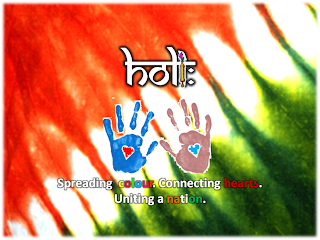
Colours of India
Without a shadow of a doubt, India is bursting with colours in every nook and cranny... as if every moment is a visual for the old Jensen & Nicholson ad - whenever you see colour, think of us". Holi is the logical extension of that myriad melee of colours - a celebration that spans the length and breadth of the country. This ad tries to depict the real colours of India that the nation celebrates every Holi.
True Colours
This ad tries to depict the true colours of India comes to forefront every Holi. Perhaps, the layers of colour that masks the faces of revelers perhaps masks the differences that divides the nation on other days of the year...
Colours Unite
Colour divides the world. The festival of Colours bring us together.

Sunday, February 27, 2011
A Cup-ple of Recycles!
Recycling is great for a greener planet but in a global internet economy, recycling ads and campaigns is not that great an idea.
About a month back, driving back from work with a couple of friends, a sea of red tail lights greeted us as usual on the Western Express Highway. A frustrated collective sigh later, the three weart travellers looked left and saw the most hilarious billboard - our first look at the Pepsi's "Change the Game" campaign. It was super funny! I mean just take a look at the visual below:

Apart from Dhoni and to some extent Virat, all the others on the billboard looked totally out of place wearing all but body paint. The ad looked like a spoof far, removed from the "in-your-face" attitude it endeavoured to convey - just look at Viru's face in the visuals. And what is Bhajji doing?!
There was a weird deja vu about the visual though. A quick google later, my hunch was confirmed - it was "glocalization" of Pepsi's FIFA World Cup ad featuring the likes of Messi, Drogba, Kaka and Henry. Check out the image below:

While the Fifa ad made sense with the football World Cup being held in Africa (with the visuals in sync with the African tradition of body painting to intimidate adversaries in battle), in sub-continental climes it really is a misfit. And what's more, Pepsi has extended this campaign to Bangladesh (as you can see in the image above)!
There is a basic cultural difference between the two games for starters - cricket (aka the gentleman's game) is known for its traditional gentle pace and "controlled aggression" (wherein the match referee will rap players on the knuckles for the slightest evidence of behaviour that "brings the game into disrepute"). The aforementioned behaviour is more the norm in football (aka the beautiful game) which is a more physical, contact sport. Thus the aggressive visuals and the body paint worked in Feb 2010.
With a plethora of stars (or gamechangers as Pepsi claims) of the likes of KP and MSD on board, the visuals could have been more original.

However, the TV commercials for the campaign are Pepsi's saving grace - they are quite funny and in line with the innovations in the game however Saqlain was the inventor of the Doosra, wasn't he? And "Pallu Scoop"... really? That is your version of the Dilscoop, Pepsi?! But which scoop is better (I am not talking to the journalists here) - Dilshan's Pallu Scoop or Sakib's Super Scoop?

Check the TV ads below - my favourite is Slinga Malinga:
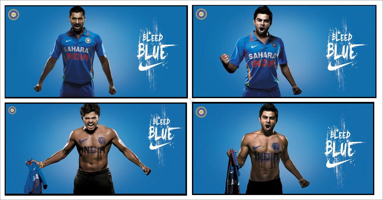
Nike seems to have taken a cue from Pepsi on more than one idea - their "Bleed Blue" campaign was going well with Virat, Zaheer and co. wearing the Team India shirt that the global giant sponsors till they suddenly followed Pepsi (must be a coincidence!) and got their models to go topless! (Virat seemed to be most at home - after all he had done it before in the Pepsi ad... and I believe his teen girl fan brigade aren't complaining!):

And check out the Zaheer ad - it is strikingly similar to the Rooney ad (they did a viral recycle of the same ad in their Write the Future ad featuring Ribery) - another recycled visual from the football World Cup?


However, all is forgiven if India wins the Cup :)
PS: I actually like the "more traditional" Adidas campaign which is (coincidentally - I guess) the namesake of the Pepsi campaign (hasn't anyone heard of IPR in this country?!) :

And you just can't go wrong with two legends of the game, can you?
About a month back, driving back from work with a couple of friends, a sea of red tail lights greeted us as usual on the Western Express Highway. A frustrated collective sigh later, the three weart travellers looked left and saw the most hilarious billboard - our first look at the Pepsi's "Change the Game" campaign. It was super funny! I mean just take a look at the visual below:

Apart from Dhoni and to some extent Virat, all the others on the billboard looked totally out of place wearing all but body paint. The ad looked like a spoof far, removed from the "in-your-face" attitude it endeavoured to convey - just look at Viru's face in the visuals. And what is Bhajji doing?!
There was a weird deja vu about the visual though. A quick google later, my hunch was confirmed - it was "glocalization" of Pepsi's FIFA World Cup ad featuring the likes of Messi, Drogba, Kaka and Henry. Check out the image below:

While the Fifa ad made sense with the football World Cup being held in Africa (with the visuals in sync with the African tradition of body painting to intimidate adversaries in battle), in sub-continental climes it really is a misfit. And what's more, Pepsi has extended this campaign to Bangladesh (as you can see in the image above)!
There is a basic cultural difference between the two games for starters - cricket (aka the gentleman's game) is known for its traditional gentle pace and "controlled aggression" (wherein the match referee will rap players on the knuckles for the slightest evidence of behaviour that "brings the game into disrepute"). The aforementioned behaviour is more the norm in football (aka the beautiful game) which is a more physical, contact sport. Thus the aggressive visuals and the body paint worked in Feb 2010.
With a plethora of stars (or gamechangers as Pepsi claims) of the likes of KP and MSD on board, the visuals could have been more original.

However, the TV commercials for the campaign are Pepsi's saving grace - they are quite funny and in line with the innovations in the game however Saqlain was the inventor of the Doosra, wasn't he? And "Pallu Scoop"... really? That is your version of the Dilscoop, Pepsi?! But which scoop is better (I am not talking to the journalists here) - Dilshan's Pallu Scoop or Sakib's Super Scoop?

Check the TV ads below - my favourite is Slinga Malinga:
Nike seems to have taken a cue from Pepsi on more than one idea - their "Bleed Blue" campaign was going well with Virat, Zaheer and co. wearing the Team India shirt that the global giant sponsors till they suddenly followed Pepsi (must be a coincidence!) and got their models to go topless! (Virat seemed to be most at home - after all he had done it before in the Pepsi ad... and I believe his teen girl fan brigade aren't complaining!):
And check out the Zaheer ad - it is strikingly similar to the Rooney ad (they did a viral recycle of the same ad in their Write the Future ad featuring Ribery) - another recycled visual from the football World Cup?


However, all is forgiven if India wins the Cup :)
PS: I actually like the "more traditional" Adidas campaign which is (coincidentally - I guess) the namesake of the Pepsi campaign (hasn't anyone heard of IPR in this country?!) :

And you just can't go wrong with two legends of the game, can you?
Saturday, February 19, 2011
Brandpotion.com || Earth Care Awards 2011
Here are my ad concepts for the brand new competition on Brandpotion.com called “The Earth Care Awards 2011” - as always, I would love your feedback and please do vote for the ads...
Introduction: Saving the environment is a task that cannot be done just by one person, one organisation or even one country. But it takes the efforts of individuals to prove that it’s possible—-that the effort of just one person can change the minds of a group of people, that the effort of a group of people can affect the actions of an organisation and so on. And while this domino effect will eventually make conservation a global phenomenon, it’s important to remember that this starts with the effort of an individual.
The Earth Care Awards 2011 has been brought into existence to celebrate the efforts of individuals, to recognise and appreciate their contribution to the environment. Go Green India is calling for ads from you to promote the Earth Care Awards 2011, which will be held on 9 September 2011.
For more information, you can log on to www.gogreenindia.co.in
The Brief: Create an ad that establishes the purpose of the Earth Care Awards 2011. You have to promote: 1) the importance of saving the environment, and 2) the Earth Care Awards 2011.
My Ads: How we can make the planet a greener place is something that all of us know - whether it is by turning off the tap when we are brushing or switching off the lights when we are leaving a room - the question is: How many of us do our bit to make the world greener? When time is running out in our bid to conserve our world for the next generation, these ads conveys that the Earth Care Awards 2011 salutes those whose actions speak louder than words!
"Actions Speak Louder Than Words"

"Paint the town Green"

"Green World - 1"

"Green World - 2"

Also, on the Go Green India site I found another cool competition running inviting designers to redesign their logos. These are my attempts to redesign the logo for JSW & Times of India Earth Care Awards. Sadly I can only upload one and ol' indecisive me can't decide which one to upload. Have a look and help! Check out this link: http://www.gogreenindia.co


Prizes are up for grabs. Best logos will win “Jury choice” and “Viewers choice” awards. Contest closes on 5th April 2011.
Friday, November 26, 2010


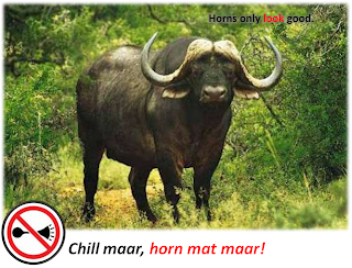
Brandpotion.com || Chill maar, horn mat maar! - Part 2
Here are some more of my ad concepts for the brand new competition on Brandpotion.com called “Chill maar, horn mat maar!” - (Click here to see the earlier concepts for this competition.) - as always, I would love your feedback and please do vote for the ads...


"Love your ears" - Mini Series


"Chill"
"Love your ears"
"Caution"
"Life is a journey"
"Love your ears" - Mini Series
Wednesday, November 24, 2010
Brandpotion.com || Chill maar, horn mat maar! - Part 1
Here are my ad concepts for the brand new competition on Brandpotion.com called “Chill maar, horn mat maar!” - as always, I would love your feedback and please do vote for the ads...
Introduction: It doesn’t matter where you’re living, India is a noisy country. With an increasing number of vehicles, the traffic situation’s going from bad to worse. Stricter anti-pollution rules mean that at least the vehicles aren’t polluting the air as much. However, there’s no way to moderate noise pollution. Honking while stuck in traffic is as useless as it is common. Most drivers seem to forget, rather conveniently, that the traffic isn’t going to move faster simply by their honking. BrandPotion’s calling for some really creative ideas to get people to stop honking when they’re stuck in traffic.
The Brief: Fight noise pollution. Get people to stop honking when in traffic.
"Horns of a dilemma"
"Think about it"
"Don't blow your own trumpet"
"Don't be a devil on the Road"
"Make Noise when it Matters"
"Horns only look good"
Tuesday, October 26, 2010
Brandpotion.com || My Winning Entries
Here are the various ad concepts of mine that won prizes at Brandpotion.com
(Click on the contest names to see the briefs - click on the ad title to see the ads)
(Click on the contest names to see the briefs - click on the ad title to see the ads)
1. Consolation Prize | "Mirror of Success" | Ad title: "Reflections of the Maximum City"

2. Best Print Ad | "Times Green Ganesha" | Ad Title: "Rejoice, Revive, Rejuvenate"

3. 2nd Prize - Community | "Times Green Ganesha" | Ad Title: "Ganesha says Think Green"

4. Best Print Ad | "Biggest Creative Team in India" | Ad Title: "Food for Thought"

Well the booty includes a Nokia X2 phone, a Samsung Corby phone, Gift Vouchers from Bookzone and Shoppers Stop.

The Bookzone vouchers came in really handy - picked up a couple of books for myself and one for my sister...
(click on the covers below to see more)


But what I am proudest of is the 3 certificates that adorns my workstation :)


And they just published my interview on the site - click here to read it.
Thanks Team Brandpotion!
Subscribe to:
Posts (Atom)